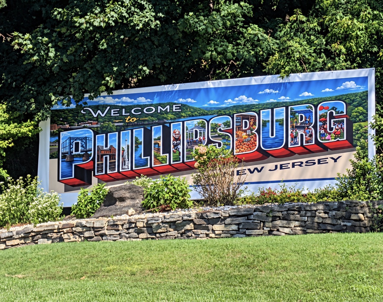
Phillipsburg, NJ - Drivers entering town on Route 22 east are greeted by a colorful welcome sign, offering a cheerful first impression before anybody has a chance to explain why they’re pissed off.
Mike Dwyer’s new design puts familiar town scenes inside the Phillipsburg lettering. It’s attractive, thoughtfully done, and dangerously close to giving people something positive to say.
After installation, it didn’t take long for Phillipsburg to hop on social media and do its thing.
Residents responded by requesting street paving, new council members, fewer warehouses, and nighttime lighting. Apparently, the welcome sign was supposed to come with a comprehensive municipal recovery plan.
The artwork captures the town’s character, although fitting an entire Facebook argument inside the letter P would have required a larger sign.
“Welcome” remains a generous opening statement for a community where the next sentence is usually, “You should’ve seen this town thirty years ago.”
Still, it’s a beautiful entrance.
“Go Back” would have saved lettering, but Dwyer was working on a welcome sign, not taking requests from the comment section.
This article is intended for satirical purposes only. If you choose to believe this bullshit, we welcome your readership, but seriously question your intellect.